
Patient Portal at the Sound Clinic
Ensuring all patients have the right to accessible digital healthcare through clarified responsive web design
PROBLEM
The Sound Clinic is known for taking an integrative approach to medicine to successfully treat everything from the common cold to Lyme Disease. Recently the clinic has established a new patient portal and tele-health platform into the existing website which has led to accessibility issues within the core user pathway.
SOLUTION
Deliver a more inclusive patient experience through streamlined navigation design, updated brand identity, and clarified user pathways enabling all patients the capacity to independently access their healthcare data.
MY ROLE
I served as Lead Designer in partnership with clinicians. My focus was to perform evaluative research leading to revamped visual design, navigation structure, data visualization, and user flows that exceeded accessibility compliance and improved overall user engagement.
New designs were shared with clinic providers and resulted in 100% increase in subjective user satisfaction and content clarity through usability testing.
TIMELINE: 4 Weeks
TOOLS: Figma, Adobe Illustrator, Adobe Photoshop, Otter AI, Zoom, Paper and Ink
Uncovering Core Problems
EVALUATIVE RESEARCH
I recruited 5 participants ages 40 to 70 for remote, moderated, usability testing. My goal was to gain insight into the barriers impacting patients' experiences navigating the Sound Clinic website into the new portal.
How did patients perceive and access the interface from the main page into the portal?
What were the main obstacles impeding patients from completing key tasks?
I closely observed users' vocalizations, body language, and responses in order to gain anecdotal evidence that would inform my designs.
Key task observations:
Locating the patient portal- All patients struggled to locate the portal due to a lack of contrast and hierarchy of information.
Logging In- All patients expressed confusion when encountering the portal log-in screen due to unnecessary data.
Acquiring Lab Results- Once, inside the portal, many patients grappled with obscure language, complicated fly out menus, and too much data displayed all at once.

HEURISTIC EVALUATION / ANECDOTAL RESEARCH
I conducted practitioner interviews, clinic reviews, and a heuristic analysis for a comprehensive understanding of core usability issues. I learned that patients are often late and unprepared for appointments due to difficulty in locating the tele-health and portal links from the main page resulting in patient frustration and overall clinic slowdown.
The key to delivering better patient experiences can be found in clarifying information hierarchy, page layout, color contrast, and content design from the home page into the portal dashboard.


Understanding Patient Stories
USER PERSONAS
I created two main personas that reflect the Sound Clinic's core patient population while also highlighting the unique pain points and needs of patients who face healthcare concerns and obstacles.
Meet Esther- An older patient with visual impairment who doesn’t consider herself to be “tech savvy." She needs to be able to independently and easily access her digital healthcare information.
Meet Allison- A mother who struggles with chronic illness. She needs online healthcare experiences that will aid in her recovery, not detract from it.
How might we enable all patients to gain quick access to vital healthcare services through frictionless and engaging user experiences?


Getting From Point A to Point B
INFORMATION ARCHITECTURE / USER FLOWS
It was important to explore the key friction areas within the main patient pathway into the portal by mapping out user task flows in conjunction with information architecture. My focus was to build simplistic navigation systems that would feel accommodating and intuitive to users.


Building Accessible Solutions
WIREFRAME ITERATIONS
I created sketches and then explored multiple layout iterations through digital wireframes to work out potential solutions to improve product utility and accessibility.
Possible solutions include:
Increasing user engagement and conversions through bold CTA's within the hero space. This will also dramatically increase portal accessibility and speed up clinic operations.
Opting for more simple progressive disclosure through "See more" links rather than slideshows that might be confusing to some users.
Reducing portal login screen to what is strictly necessary for patient success.
Enabling easier patient sign-in through an AI chat box on the log-in page.
Increasing scannability and reducing cognitive load through clear language, icons, and simple menu design within the portal dashboard.
Sketches

Mid-fidelity Wireframes Iterations

Validating Design Solutions
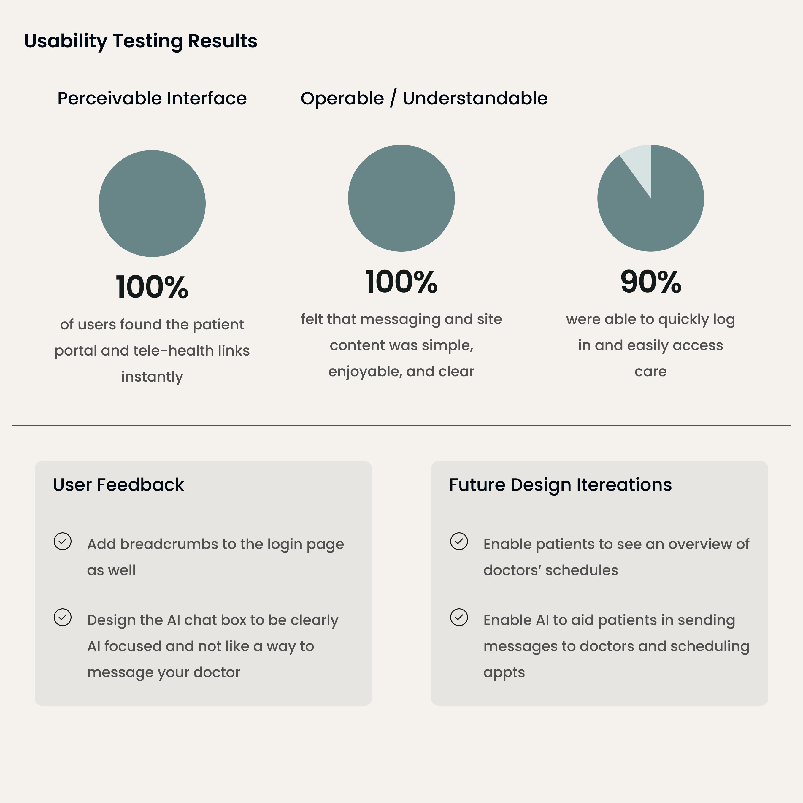
USABILITY INSIGHTS
I recruited 5 participants for remote, moderated usability testing including A/B testing using mid-fidelity wireframes. My aim was to gain qualitative insight into which solutions resonated with users and how I could further improve the user experience.
All users accessed the patient portal and specific health data in under 1 minute. All users expressed satisfaction with the new portal design and ease of acquiring their data.
A/B testing revealed that users preferred designs which reflect repeating vertical orientations for the portal dashboard. Feedback also centered on clarifying AI chat to reflect portal assistance and not a way to message providers.
Establishing Accessible Design
UI KIT / DESIGN SYSTEM
Utilizing branding centered on natural, holistic health, I crafted a Design System and component library that is both visually dynamic and aligned to WCAG standards.
Color Pallet- I implemented a combination of gray, green, and soft blue hues to convey health and healing. All color combinations exceed AA compliance.
Fonts- I utilized Freight Text Pro and Proxima Nova, both known for high readability.
Components / Icons- I incorporated highly legible buttons, cards, and icons to reduce cognitive burden and create content that can be easily scanned.
Key elements are shown below.

Full Fidelity Prototyping
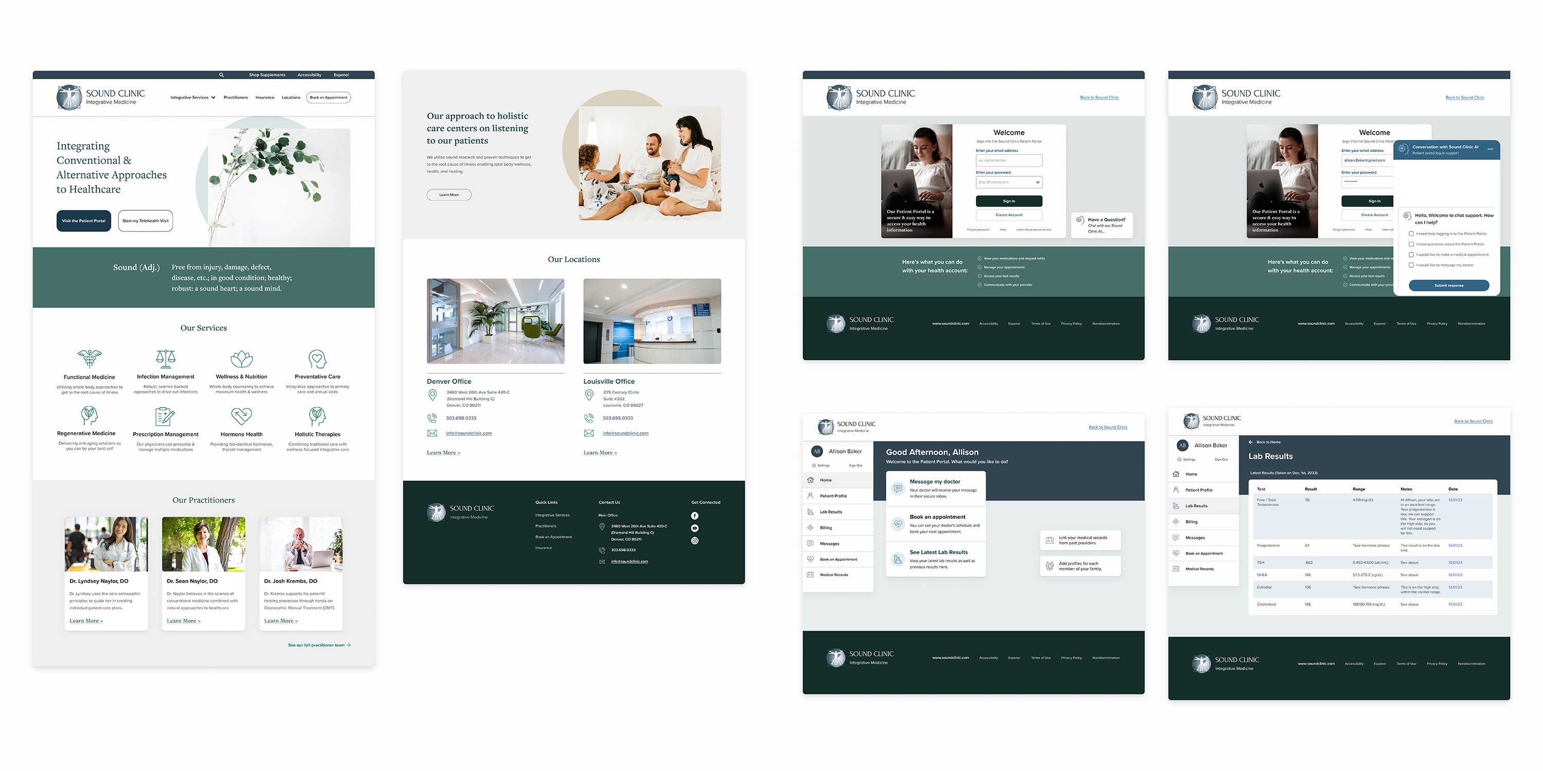
DESIGN COMPARISON
I integrated user feedback and visual style elements into full fidelity responsive prototypes for web and mobile viewports. I clarified the AI chat box through conversational design offering users easy prompts for portal assistance. I also implemented the preferred vertical menu design for the portal dashboard.
Design Impact:
Homepage- Utilized dynamic use of header space to emphasize bold CTA's enabling quick, direct access to the portal and tele-health links.
Overall Design- Building a more modern visual design with clear brand identity that is consistent from the main page into the portal dashboard.
Patient Portal Log-in- Enabling easier portal sign-in through a reduction of cluttered data and visual design.
Portal Dashboard- Enabling patients to independently access healthcare data with a simplified navigation design, breadcrumbs, conversational prompts, engaging interaction design, and call to action buttons within the portal dashboard.
Home Page Before (Left) and After (Right)

Login Page Before (Left) and After (Right)

Dashboard Before (Left) and After (Right)

Full Fidelity Prototypes
Mobile View- Try it out!
Final Thoughts
Digital Accessibility is a Human Right
Throughout the usability testing sessions, I was struck by how several participants were unable to complete what could have been simple tasks to allocate vital data. These participants would have likely called into the clinic or gotten a family member to help them. While asking for help is great, it is crucial that humans can feel empowered to manage resources on their own. The usability issues present at the Sound Clinic were all minor inconveniences that added up to major frustrations for patients while impeding clinic success.
By addressing the usability and accessibility issues, all patients can independently navigate their healthcare, leading to better healthcare outcomes for patients and more streamlined operations for the Sound Clinic.