
The US Department of Labor
Envisioning a new website focused on the rights of workers
PROBLEM
The US Department of Labor was established in 1918 to protect the rights of everyday laborers. Today the main website houses hundreds of laws, programs, and organizations within an outdated, disorganized, and inaccessible interface making it nearly impossible for workers to secure labor resources.
SOLUTION
Utilizing strong information architecture design, we brought order to dense collections of data. We brought in affordance, matched users' mental models, and articulated accessible UI patterns leading to a more human centered government website.
ROLE
I served as Lead UX/UI designer on a collaborative team at the University of Denver. I conducted in depth usability research and testing, analyzed and synthesized data into user flows, wireframes, visual design, information architecture, site maps, and full fidelity prototypes.
TIMELINE: 4 weeks
A Frustrating User Experience
EVALUATIVE TESTING
We recruited 7 participants to help evaluate and take stock of the key usability issues within the main site pages and navigation design by measuring site perception, task completion success, and overall user experience. Participants were asked to complete simple tasks like downloading unemployment forms and finding disability resources.
We discovered that completing everyday, simple labor tasks was next to impossible for most users.

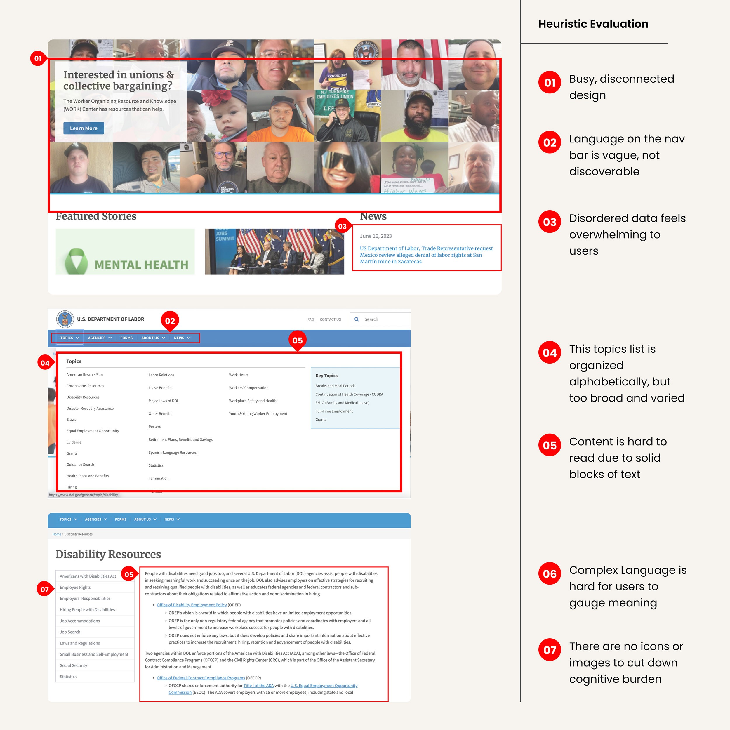
HEURISTIC EVALUATION
We performed a usability analysis and discovered multiple accessibility issues such as obscure language titles, dense drop down menus, and a lack of design consistency within the US DOL interface.
Defining the Core User
USER PERSONA
We documented users' natural learning patterns, needs, and pain points from our evaluative research observations into a persona. This enabled us to visualize the larger human experience of how workers contend with labor obstacles.
Ray Douglas is a construction site manager who has faced a recent on the job injury. He needs easy access to specific programs and tools that enable him to overcome this obstacle and find abundance.
How might we create a more human centered government database that enables the everyday worker to access and utilize vital labor resources?

Visualizing a Better Pathway
INFORMATION ARCHITECTURE
We utilized card sorting to gather natural categories from user’s mental models in order to improve obscure language content. We found that applying both strong categorical hierarchy and alphabetizing data created more intuitive navigation design.
USER TASK FLOWS
We reflected observed user behavior from our usability testing sessions into several task flow iterations. This enabled us to articulate natural pathways that users take while navigating through data structures such as direct and exploratory patterns.


Exploring Visual Compositions
DIGITAL WIREFRAMES
I took the lead transforming research insights, information architecture, and user flows into sketches and then wireframe designs. My focus was to bring together key UI patterns and natural mapping structures to transform data complexity into more manageble and clarified user experiences.
I utilized both low and mid-fidelity wireframes to create compositions featuring gallery display patterns, thumbnail patterns, and progressive disclosure with typographical hierarchy.
Sketches and Iterations

Mid-Fidelity Wireframes

Testing Our Solutions
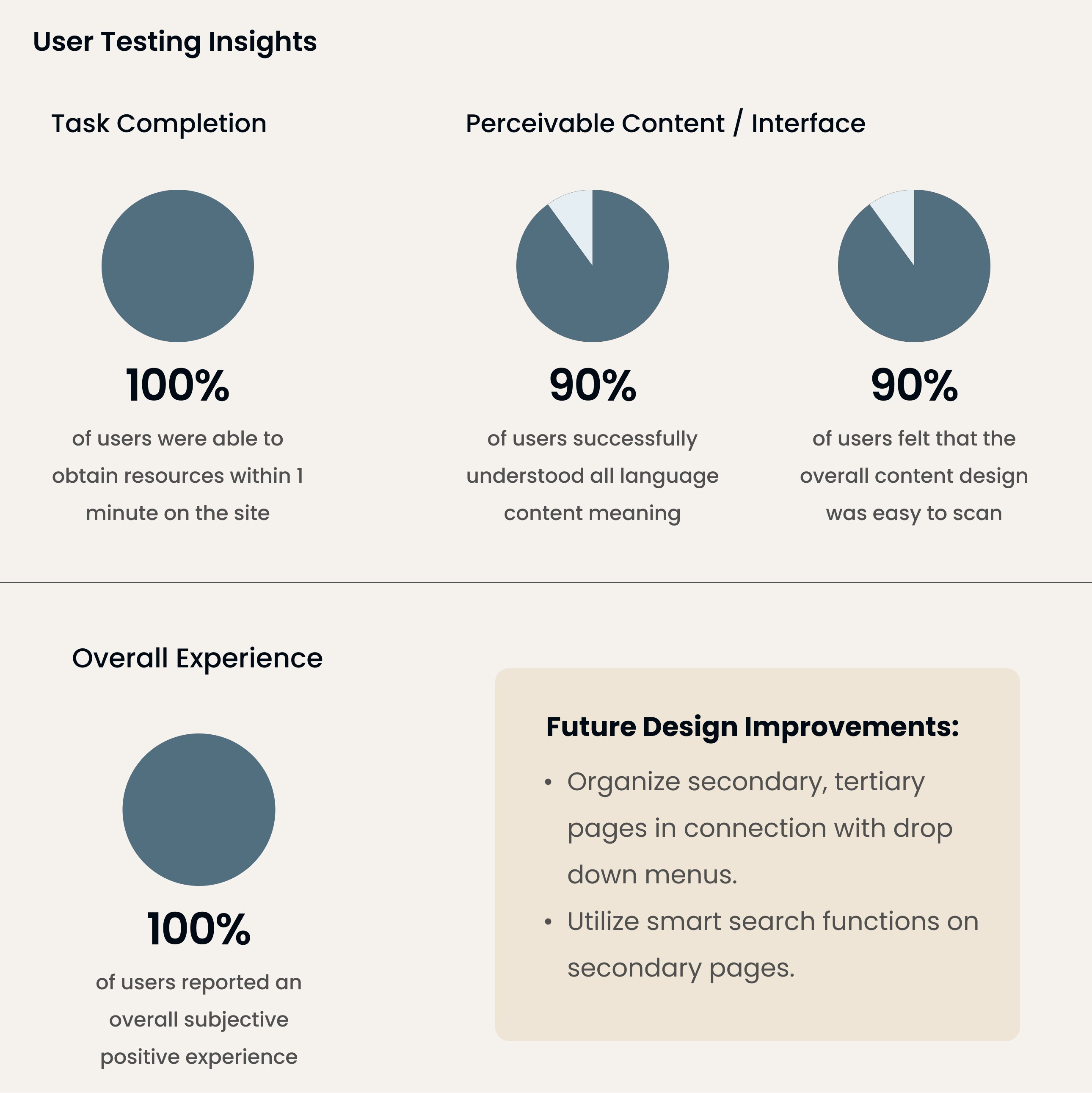
SECOND USABILITY TESTING
We conducted multiple rounds of usability testing utilizing gray scale, mid-fidelity wireframes in order to gauge the accessibility and perceivability of design features. We measured subjective usability experience and time to task as key metrics.
All participants were successful in locating labor resources in under 1 minute with a marked improvement in both accessibility and overall positive user experience.
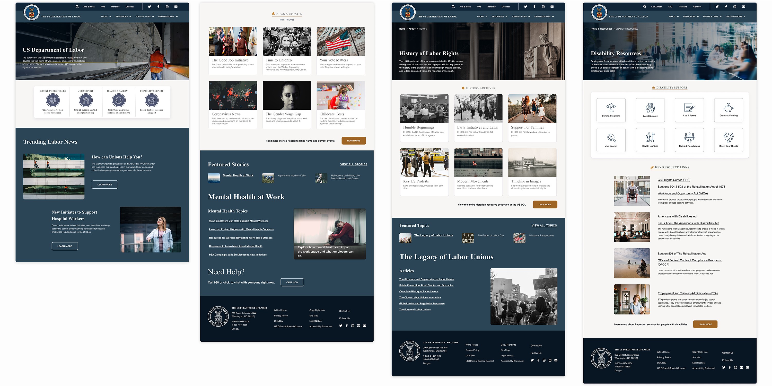
Full Fidelity Protoyping
I incorporated user feedback as well as stylistic elements into full fidelity responsive prototypes featuring the following solutions:
Streamlined navigation design- I utilized accurate breadcrumbs, clear language titles, and curated drop down menus to create better user pathways.
Reduced cognitive load- I implemented iconography, thumbnail UI patterns, and progressive disclosure for better readability and clarified data.
Improved accessibility- I increased color contrast, implemented clear imagery, strong content hierarchy, and simplified visual design for more inclusive design.
Increased user engagement- I emphasized strong affordance, style consistency, and strategic call to action buttons enabling a more delightful user experience.
Full Fidelity Designs
Reflection
Every sight tells a story and brings an emotional experience to visitors. The lack of usability within the US Department of Labor's site created a feeling of exclusivity rather than reflecting the needs of diverse users. The challenges we faced stemmed directly from the deep usability issues amidst an overwhelming amount of data. We found that utilizing atomic design, usability heuristics, affordance, and strong hierarchy were the keys to our success.